Master bathroom makeovers are popular these days, and today I am showing you what Connie and I did with our friend Janice’s master bath.
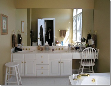
Here are a couple of before pictures. In this first picture, notice the arrangement of the cabinet with two sinks side by side and the kneespace shoved all the way to the right. The cabinets were white with polished brass fixtures and cultured marble countertops and sinks, typical of mid-1990’s construction. Also typical is the large mirror that spans the entire wall.
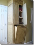
If you look in the mirror, you can see the opposite wall with the door that leads into the toilet/shower space. That’s a clothes hamper that’s tucked behind the door. If you keep reading, I’ll show you what we did with that space.

We started by gutting the bathroom—cabinets, mirror, floors, whirlpool tub, shower—everything went. Here is a picture of the new cabinets. We raised the cabinet height to 36” and moved the kneespace to the center for a more balanced look.
New granite countertops are St. Cecelia with undermount oval sinks in biscuit. We used a mosaic tumbled marble for the backsplash. The Venetian bronze faucets are from the Delta Victorian collection.
The two mirrors over the sink were a bargain from Kirkland’s, and the round mirror above the kneespace once resided in Donna’s master bathroom that I showed you HERE. It didn’t work for Donna’s new look, but it was perfect for Janice’s bathroom. Janice purchased the stool from Ballard Designs.

Janice’s cultured marble whirlpool tub was replaced with a large soaker tub in biscuit that we dropped into a tiled tub deck. We used the same 20”x20” tile on the floor in a diagonal pattern. The tub splash repeats the mosaic tile used at the vanities.


29 comments:
What a gorgeous transformation. The new cabinets, granite, tile and accessories are all just stunning. It looks like a totally different room. I just LOVE it all. Beautifully done. Hugs, Marty
Now thats a professional transformation...it is very well thought out and executed...love it all..
That is fabulous! Love the way the cabinets turned out and the colors are great. Also love the way you hung those mirrors and the different shapes. Linda
I love the color of the cabinets and the vanity between the sinks. What a gorgeous bathroom. Thanks for sharing! Sonia/Miss Bloomers
What a wonderful makeover! You did a fabulous job!
What a great transformation! Beautiful bathroom.
WOW!!! you have a true talent for makeovers. this bathroom looks awesome!!!
This is absolutely beautiful!!!!!
Hope you don't mind but I think some of these pics are headed to my project file for reference in the future :0)
~Sherrie
Kathy... what a beautiful transformation! You can drop by French Lique and transform my bathrooms anytime!
blessings. Dixie
Oh Kathy - what wonderful inspiration you have given me. Our bathroom gut-job should have already begun - but me and Mr Grits keep going back and forth on what we want. We have a very small Master, so we are trying to utilize as much space as we can. ugh!
What an amazing transformation. It is simply spectacular. Thank you so very much for providing these wonderully, inspiring pics. Hugs, Barb
What a great transformation! I especially like what you did to the sinks and mirrors...Christine
Love the edge on the soaker tub...gorgeous!
Beautiful! It doesn't even look like the same space. Now, I've got some rooms that need redoing next time you're in Ark.! laurie
I love it! Great job! I love the granite and the tilting hamper. Sweet addition!
NICE update!!!
Once upon a time we had a tilt-out laundry hamper just like that - - - I LOVED it.
This is a great bathroom re-do! Love the new cabinets and the color they were painted! Love the tile and the granite!
Holy Moly! What a difference a day makes!
Hi Kathy !
Wow, what a beautiful bathroom ! The space looks really large - I would kill for a bathroom that big ! I love the seat in the middle of the sinks and the colors
are so warm and buttery (I love,love butter, LOL) Looks like there is plenty of storage - I girl
can never have enough....I would like to do my masterbath over, so
this gave me some inspiration, thanks a bunch ! Have a great week !
Hugs ~ Kammy
Wow! I did a double take. Love the little vanity space. Great job!
Kathy: This is GORGEOUS! I love it! Classy and Rich! Ya'll did a Fantabulous job on this!
I am a wee bit envious!
Have a great week!!
Lou Cinda :)
Can I hire you to help me redo my bathroom? It is gorgeous. OK so now I am going to go back into my bathroom and smash that big ugly mirror I have that looks just like your before photo:)
Joyce
It looks like a totally different bathroom Kathy. You did a beautiful, professional job. I had an old cramped cultured marble shower, and the new enclosure with the glass doors just makes all the difference. Your color palette is wonderful. Bravo, to all of your hard work and a transformation that could be showcased any magazine.
WOW. I'm drooling over here!
I love the transformation. Beautiful bathroom. Debbie
This renovation is absolutely stunning! I LOVE IT ALL!
{{HUGS}}
Robin :o)
Now that's a metamorphosis! Well done and very classy and beautiful~
~Really Rainey~
This is beautiful! You did a great job. I love the balanced look of the sinks in the new do.
I'm glad that I've found your kbeau.blogspot.com blog. You sure can write and teach and inspire. Keep writing - I'll keep reading.
Post a Comment