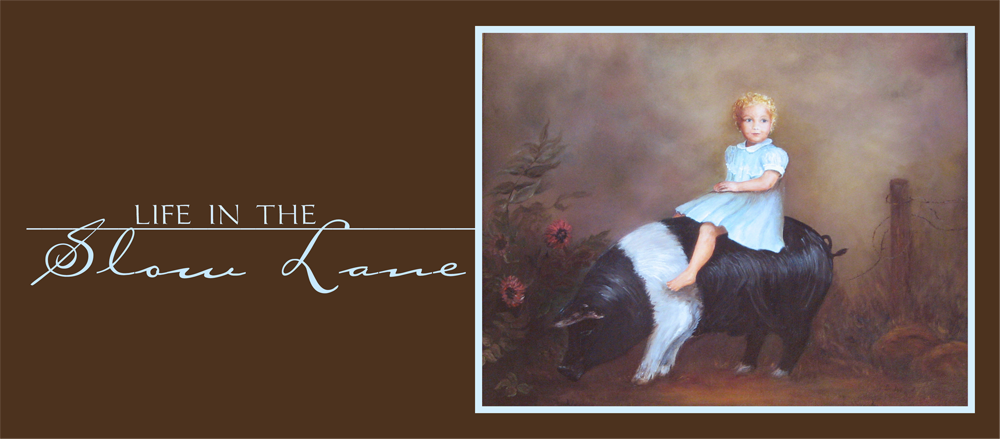
 I had already made a new header for my blog, using a picture of a girl on a pig. It's actually a picture of a painting that my aunt did, and the girl on the pig is yours truly. I decided that I wanted a background that would work with the colors in the painting.
I started by reading the detailed instructions I found in Blog Secrets on The Cutest Blog website. You can find them here.
The next hurdle was to learn a little more about PhotoShop Elements. I had previously used PS Elements to edit photographs, but I had never created something from scratch. In the past, I have found that trying to use the help files on PS Elements is like trying to navigate a very complex maze. If I just had someone to show me how, I could do this. A little Google search produced enough help to get me started. The rest was trial and error. A time or two I would get to a point and could go no further and couldn't undo what I had done wrong. When that happened, I had to start over.
I found the paper and all of the elements I used for my background and header on DigiScrapDepot.com. They have thousands of freebies that you can grab for personal use.
 Once I had my completed page (the first version looked like this), I had to establish an account with Photo Bucket, upload the file and follow the instructions for editing my background on Blogger. The first time around I couldn't get it to cover the entire screen. I even upgraded to a Photo Bucket Pro account, which costs money, so that I could upload it as a 2 megabyte file. No luck. However, once I saved the page as a smaller jpg file (medium file, using PS Elements), the problem was solved.
Now that I sort of knew what I was doing, I played around with the background some more and tweaked the header to coordinate with the background. What you see probably won't be the last version. I had too much fun to quit.
 I'd love to know what you think, and if you have suggestions to share, just post them in the comments. If you'd like to read more Show and Tells, be sure to visit Kelli at There's No Place Like Home.


19 comments:
You did a fab job! I love the painting of you on the piggie-very personal. : ) Reminds me of the Jamie Wyeth pig a bit.
The painting of you and the pig by your aunt is a treasure. Really pretty! And I like your new background...Christine
No, I do not know Buzz Harper, Katy. Who is he and why do you ask?..Christine
Thanks for your comments on my blog. This is where I made the header for my blog. I believe I had to use the print screen button and then save it in my paint program.
http://metaatem.net/words/
You did a good job and how wonderful you had the special painting for the focus.
Susan
I love what you did with your blog. I have also been thinking of doing my own.
You did a fantastic job!!!!I have wanted to do the same but just haven't gotten the nerve yet.Thank you for this Info.
Blessings,
Sue
Wow..you did great! If you ever figure out how to do 3 columns - let me know. I have been trying for months.
You have really inspired me!! And how fabulous is it that YOU are the little girl on the piggy!!!! Couldn't be more perfect for "life In The Slow Lane!" *winks* I have long wished that I could find a blog background that would be perfect for me and I haven't quite found the right fit so far....But maybe I really can make my own??! Anyhoo I found you through my friend Lauries blog and your blog looks beautiful!!!Great job!! Vanna
I'm so impressed! I have a hard enough time just getting Cutest Blog to work. Between changes I forget what I did before. Step by Step directions would be appreciated:) I think your picture really makes the page.
You've really gotten into this blog stuff, haven't you. You must have too much time on your hands! You should be with me in Destin trying to decorate this condo. June and I are having a tough time. Nobody is carrying much inventory in their stores!
It looks great! How neat that you are the little girl in that painting. laurie
MarMar, you and June just need to go to market with me. We could really do some damage.
Great job...love the colors (my faves)...does this mean you have to actually have photo shop to do this? I am so technically challenged...
Blessings,
Susie
Nice job! Came here from CBOTB website. I'm thinking of trying to create my own background too.
Excellent job - both the header picture and the background! Love it (I'll admit I was looking for the CBOTB logo when I first saw it, that's how good it is!) and it's great to see your earlier version too. I managed to get a signature on my BladeRubber blog, and changed to 3 columns on 1stFloorFlat, so I feel I'm getting there... now for the next step! You make me feel it's achievable.
Thank you so much.
Thanks for the other comment on my blog - re the columns, I adjusted mine (the side widths are narrower and the centre one is wider) from the recommended sizes TCBOTB gave me: it still worked fine. Adding a signature was the easy bit!
Where I'm having trouble - my background (which I have changed quite a few times before settling on this one) now has the most awful colours for the links & visited links - which won't edit! The blue, especially, strobes badly. However, I WILL solve it, given time (a lot of time...)
i don't even want to think about it. i've been trying to put a new background on my blog all afternoon and managed to lose the one i had and can't get a new one on there. i need to my son to come over and help me! i wish i could do what you did - you are so smart! do you hire out? - lol
There is always room in The Shadow of the Cross. Feel free to visit anytime :O).
I'm impressed! I'm not very computer savy. I couldn't even figure out how to add the background's I had (I purchased a web grahic CD with many backgrounds included)I decided to just go with the free backgrounds from the cutest blog on the block, at least I could figure that out! You did a nice job on your blog!
Brenda
Post a Comment